Christopher Ward Watches Review – A Definitive Review (The Twelve 36mm & Sealander C63 GMT)
(This page features affiliate links, for more information click here.)
When people ask what I do for a living, they inevitably follow up with the same question. “What’s the best watch, then?”. It’s the equivalent of asking a magician to show you a trick on the street, and like most magicians, I have my go-to response.
If you’re on about the best *build* *quality*, in my experience, once you pay over a grand, most watches are built to a similar standard (the recent Tag-Kith collab notwithstanding, of course). I mean, £1,500 for a plastic watch? Are you kidding?
Typically, though, past a grand, most watches are built pretty darn well, and the differences are often down to brand prestige, heritage, and marketing costs more than a dramatic uptick in construction. It’s a generalization, and there are watches that buck this trend, but if I had to draw a child-like chart on the relationship between price and build quality, it’s probably something like this. As you can see, it’s a game of diminishing returns, especially near the top end.
The brand I’ll be reviewing today has built its whole business on supposedly exploiting this phenomenon. They’re Christopher Ward, a British company making waves in the luxury watch community in recent years.
They’re openly going after some of the big players in the watch industry in a similar manner to numerous fashion watch brands I’ve exposed over the years. They mention luxury markups, industry shake-ups, and premium construction.
I mean, some of these phrases are as close to verbatim as it gets; even the almighty ‘middlemen’ get a shoutout!
The main difference is the watches they’re selling aren’t £150 or £200 quid, no...they’re a grand each. £1000 a pop! A completely different proposition.
Across their site, they infer, if not directly claim, that their watches are made just as well as the big luxury brands that retail for multiple thousands. Specifically, they’re positioning themselves at the point where the diminishing returns curve starts to level off completely. These are supposedly the lowest possible cost at which the maximum level of quality should be pretty much attainable while removing as much of the brand tax as possible.
I read all this after they reached out to me, right, and whenever I hear these sorts of claims, I am immediately scepticle. I’ve reviewed some pretty stellar watches for well under the £1000 mark, and it got me wondering. How do these stack up in reality? Instead of going upward and comparing to Rolexes and Pateks, I’m much more interested to see how they compare to some of the best brands at, say, £200, £500, and £750. Are they really that much better? I mean, I’ve heard people speak similarly of the Tissot PRX, calling that the lowest entry point to luxury watches, too.
I’m also wary of this against-the-grain style messaging, which has gained notoriety in recent times.
Christopher Ward Watch Review
So, here are the two watches Christopher Ward sent in for review. For full disclosure, they haven’t paid me any money for this post. However, they have since said I can keep one of these samples if I want to.
From Left to Right: Sealander C63 GMT & The Twelve
They’re pretty much at my cut-off point here at Ben’s Watch Club. If you’re considering parting with this much cash, it’s no small sum, so I’ll aim to be as detailed as possible.
I think they were extra keen to send me this pair, as they are new 36mm versions of two of their most popular models: the Sealander C63 GMT, a sporty GMT, and the Twelve, an integrated bracelet sports watch. I’m well known for my rather petite wrist, of course, if you’re weighing up other models, hopefully, this post still proves useful.
Packaging
In terms of packaging, it’s immediately apparent that this is a far cry from all the previous ‘affordable luxury’ brands I’ve reviewed. These watches were shipped in gorgeous, weighty wood and bamboo boxes that were clearly produced with tight tolerances. They open and close with a similar vacuum effect to high-end smartphone boxes and even have tiny magnets that securely connect the insert to the surround. Very, very snazzy.
Unlike many of the lower-cost watches I review - where I’d rather they skimp every penny on the box to reallocate resources to the actual watch - if you’re dropping over a grand, you want it to feel special, and I do think this is appropriately special without being overkill. Even the documentation perfectly slots into place for maximum OCD alleviation.
When you first see these watches in the flesh, it all adds up. Unlike some infamous brands I’ve covered before, Christopher Ward seems to have made a genuine, realistic attempt at this whole ‘affordable luxury’ formula.
They aren’t just stamping a fancy name to a low-quality, dirt cheap Chinese-made quartz watch, selling it for £200 and claiming it’s now ‘premium’ and ‘disrupting the industry.’
These are Swiss-made, they’ve got big specs, and they are only on the very cusp of ‘affordable’ for the everyman. While the claims are similar, their products are starkly different.
Christopher Ward Sealander C63 GMT Review
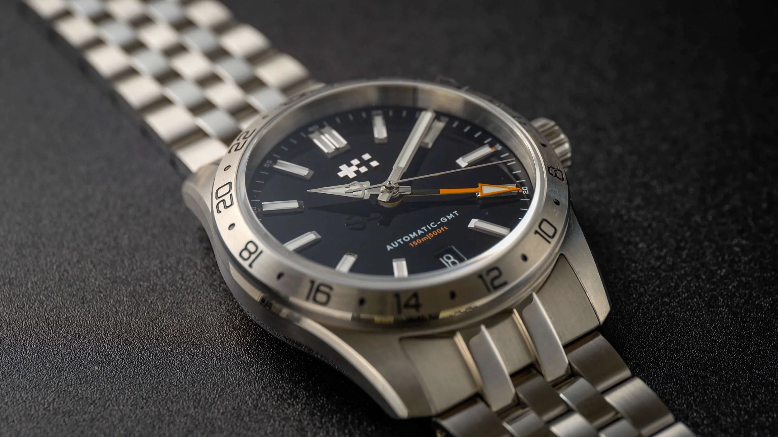
Let’s begin with the more reserved of the two, the Sealander C63 GMT. This is a new variant of the Sealander sports watch, which is supposedly one of their best-selling models. On paper, this isn’t massively different from watches I’ve reviewed before, with the only standout spec on the list being the movement, which we’ll get to shortly.
Case Construction
Nevertheless, in the hands, it became quickly apparent that this was one of the best-constructed watches I’ve come across. When it comes to 316L steel watches, the case finishing exhibited here is about as good as it gets. The brushed portions exude a satin-like sheen, while the polished areas are silky smooth to the touch.
Christopher Ward calls this their ‘light-catcher’ case, which is a surprisingly accurate moniker, as the sculpted shape, combined with the alternating surfaces, provides an intriguing array of reflections you won’t find on more simplistic lower-end watches. Is this a world away from some of the best budget brands I’ve seen? No, I wouldn’t go that far, however, I do think it’s approaching the ceiling of what is physically possible on a non-haute horology watch.
Sealander c63 Dimensions
What’s great is the watch is already pretty slim, but this segmented shape and finishing gives the illusion of it being even thinner, to the degree that this automatic GMT rivals the dimensions of a quartz watch.
It comes in with a width of around 36.4mm, depending on where you measure, along with a 42.7mm lug-to-lug and 11.5mm thickness. That thickness includes the raised crystal.
This unisex version of the watch is perfect for me, with proportions clearly tailored to slim arms. For something meatier, the 39mm Sealander GMT is available in all the same colors, plus an additional ‘Hunter Green’ version.
Dial Design
Now, my pick for either would be the intoxicating ‘Dragonfly Blue’, which I think looks head and shoulders above the others from the online images. However, the only one Christopher Ward had available for sampling at the time was this more reserved black model, hence why it’s here.
I don’t mind this dial. It’s got a glossy, enamel-like sheen that still manages to retain the extreme legibility provided by all the white accents. The surface is very smooth and sleek, though the overall simplicity of the look does mean that similar dials can be had for less money elsewhere.
In fact, this monochrome diver-inspired design reminds me a lot of the Casio EFV-100 series that I reviewed several years back, with the non-GMT version of this watch being an even closer match. As you might imagine, though, given the gulf in cost, there is a huge difference when it comes to the finer details.
The markers, for example, are beautifully executed, with wedge-like polished tips that catch the light at different angles than what I’ve come to expect from other watches. When you get even closer, their neatness and cleanliness become even more apparent. The double marker at 12, in particular, is an unforgiving, risky choice that could quickly become an eyesore if the alignment were a fraction off; in fact, this is one of the most common imperfections I come across with handmade watches at all price points. Thankfully, both of these units avoid this issue.
Like many premium watches, the handset of the Sealander GMT makes use of dual finishing techniques, with both brushed and polished portions on the two main hands. The minute hand is pretty standard fare, with a brushed central strip and tip flanked by glossy strips on each side. Nevertheless, it’s the first time I’ve seen such a short hour hand be treated in a similar manner. This sword-arrow hybrid is mostly glossy, like most watches, but there’s an unusual diamond-shaped section of brushing at the very tip, meaning that this section typically often catches the light at different times than the rest of the handset. I’m not sure whether I like it or not, but, in certain scenarios, it does improve legibility a tad.
Branding
Of course, we can’t talk about these intricacies without mentioning the logo, at least for a moment. This thing has been through the wringer. Years ago, Christopher Ward relied on written versions of their logo, often positioned off to the side. Occasionally, they would switch to a truncated “Chr. Ward” version instead. Then, they tried a contemporary, almost video game-style typeface. In essence, if they weren’t straight-up ugly, they were busy throwing off the balance of the whole dial.
Thankfully, in recent years, someone at Christopher Ward came to their senses and decided to overhaul the logo once and for all. Nowadays, their watches ship almost exclusively with their dual flag icon at the top center of the dial, which I’m sure presents some manufacturing challenges but looks so much better. This represents Switzerland and England, the two countries that make up the DNA of Christopher Ward. Other elements of the watch still retain a written version of the branding that, while sedate, is at least inoffensive.
I’ve gone from hating the branding to quite liking it. My only remaining gripe on this front is the actual name of the company. I’ve never loved product branding that sounds like you’re saying a person’s full title. I find it hard to remember at first, just like real names, and it always makes it that tad more awkward to describe to those unfamiliar with the brand.
Unlike Daniel Wellington or Filippo Loreti, Christopher Ward is at least a real guy. He’s one of the co-founders, in fact, though he left the company a few years back to pursue other ventures.
Most big watch brands have single-word names, so I wonder if perhaps my preference is actually a result of social conditioning. Some of it could also be the tainting of this approach by the recent influx of those sketchy watch companies named after fictional individuals purely engineered for marketing purposes.
Of course, the latter isn’t Christopher Ward’s fault, and it’s too late for them to consider renaming. I’m just curious if any of you feel the same way.
Bracelet
Something else I was initially frustrated by was the bracelet. Frustrated is very much the right word here, not so much angry. You see, the bracelet that shipped with this sample is a butterfly-deployant type. These look great when fitted, as they leave a sleek, uninterrupted appearance; however, getting said fit usually proves tricky. These clasps don’t house any micro-adjustment holes, with some models including shortened links as a mediocre compromise.
Unfortunately, even these weren’t present on the bracelet that shipped with the C63 GMT. As such, despite the $1000 price tag, I couldn’t get the perfect fit. A watch nerd’s worst nightmare!
Luckily, it seems Christopher Ward foresaw my nightmare, as they were already finishing up a revamped version of this “Consort” bracelet, which they shipped to me the following week.
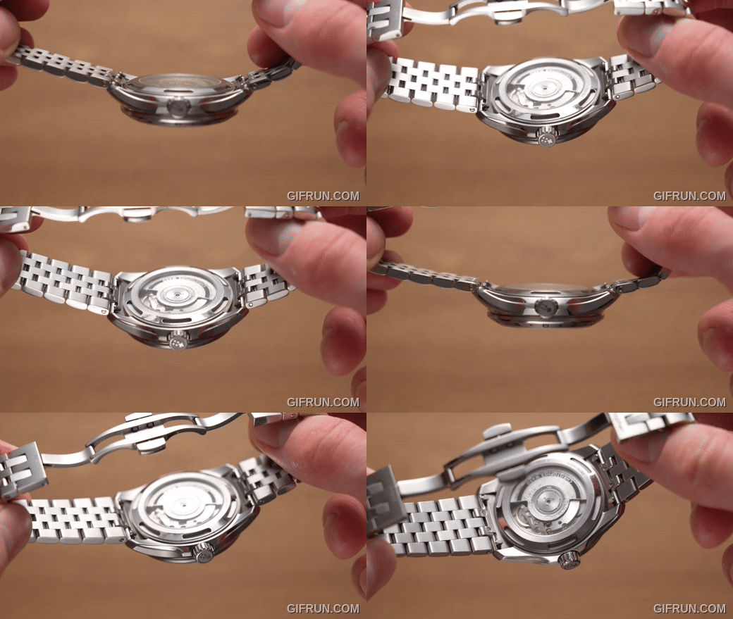
Not only does this have the aforementioned smaller links, offering up some level of tinkering, but also a discreet micro-adjustment system, which is, to my knowledge, the first of its kind in the watch industry. The links on either side of the clasp have built-in friction-fit mechanisms, where you can lightly tug them to provide 1.5mm of wiggle room on each end.
It’s not a perfect solution; you are essentially separating the links so you can see when the adjustment system is engaged if you look closely. Nevertheless, to my knowledge, nothing else like this exists at this price, and it doesn’t add any bulk to the bracelet, so its inclusion is fantastic. If you’re spending this much on a watch, you may be expecting designs or features that separate it from lower-cost watches, and this pretty neat innovation helps do just that.
Whether this system will ever make its way into their other watches remains to be seen, but it is set to be the default on the Sealander GMT in the near future.
Crystal & Water Resistance
Across the top of the watch is a piece of sapphire that stands proud from the bezel. It’s the only acceptable material here, from a scratch-resistance perspective, and while they don’t market it as any sort of selling point, the final result is crystal clear, with none of the murkiness you’ll often find on cheaper sapphire crystals.
While scratches will always be a threat, water is also somewhat of a concern. The last thing you want is your $1000 watch perishing the second you wash your hands. Here, the Sealander GMT lives up to its name, with a high 15ATM water resistance rating, so long as the crown and rear remain secured. Oddly, these are two of my favorite parts of this watch…not sure I’ve ever said that before!
There’s no other way of saying it: this is the best crown I’ve ever operated. It truly is silky smooth, with virtually silent operation, boasting the perfect amount of tension, with no roughness or looseness at any point. In other words, the Goldilocks of watch crowns! Of course, it screws in to create the best seal possible, and it’s got sufficient grip, paired with the dual flag logo.
Case Back
Something that immediately struck me was the case back. If you’ve watched many wristwatch videos on YouTube, you’re probably accustomed to the square and circular notches dotted around the outside. These are designed as slots for caseback removal tools, so the movement within can be inspected or serviced with relative ease. Here, though, these cutouts are extended in a trench-like manner, with a blasted finish inside. I’ve never seen this on a watch before, so I asked my contact if these horological hot dogs had a particular purpose or were more of an aesthetic choice; he confirmed it was the latter.
To that end, I think these provide a fairly elegant and unique twist on an element that’s often overlooked. I’ve never seen anything quite like it, and unlike some brands’ proprietary casebacks, its removal won’t require custom tools.
Movement
Whatever you think of the cutouts, sat between them is the all-important movement. This is the Sellita SW330-2, a Swiss GMT movement with a fairly smooth tick rate of 28,800 beats per hour. It’s the same model as in the larger 39mm version of the watch, and you’ll quickly notice it’s not the flashiest movement out there. It isn’t as eye-catching as the highly decorated Maen GMT I looked at a couple of years back, for example, so if you’re after something you can quickly flex to your mates, you may need to look elsewhere.
Nevertheless, this heavily modified ETA 2893-2 clone has some party tricks up its sleeve. Firstly, some of the upgrades have given this baby a mighty 56-hour power reserve, even with the fairly high beat rate. This is an office or “caller” type GMT, so you can’t adjust the hour hand independently, but you can quick-set the GMT hand instead.
This unit is running at approximately -2 seconds per day, which is great.
It has hacking, handwinding, and more; you can check out the super nerdy details elsewhere.
What’s most impressive to me is how tightly packed this Sellita is in its housing. CW has left barely any space whatsoever between it and the glass rear, as you can see. You get the impression that they set out to trim as much unnecessary fat as possible, and had the culinary precision to successfully pull it off.
There are three versions of this movement that brands can pick from, from the listings for this watch, they appear to have gone with the lowest-tier Spécial or Elabore grade, which has a fairly subtle Colimaçoné or ‘spiral’ finish across most of the surfaces. The rotor is a little more eye-catching, with a custom design that features microscopic Christopher Ward logos, combined with a text-filled rim.
Overall, the C63 Sealander is a very high-quality watch that also looks like a high-quality watch. Despite this, the finished look isn’t totally to my taste. If I were to pay this much for a watch, I’d want it to look a little more special. The black Sealander GMT doesn’t have the unique pizazz or X-factor that would urge me to part with so much cash. For me, a grand is a hell of a lot of money. The Dragonfly Blue version...now that may be a different story, but I’m yet to see it in the flesh.
On that note, we have another watch to discuss. One that may pack the added punch I’m looking for.
Christopher Ward Twelve Sports Watch Review
This is the Twelve sports watch, the same one that several YouTube reviewers were drooling over, only this time in a 36mm case size. While other watches from Christopher Ward have received praise over the years, I think it’s fairly obvious why the Twelve generated such a buzz.
Dial
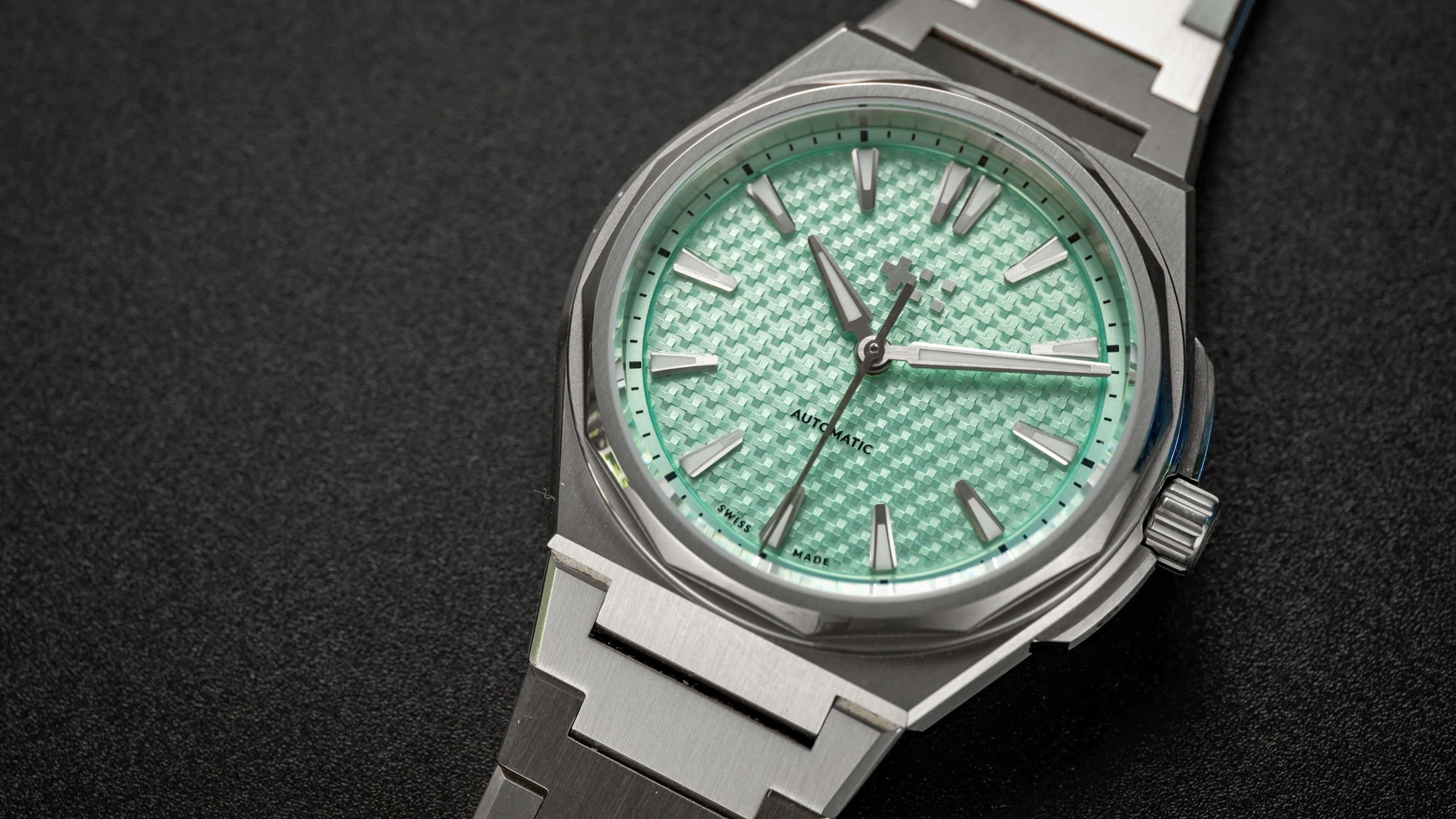
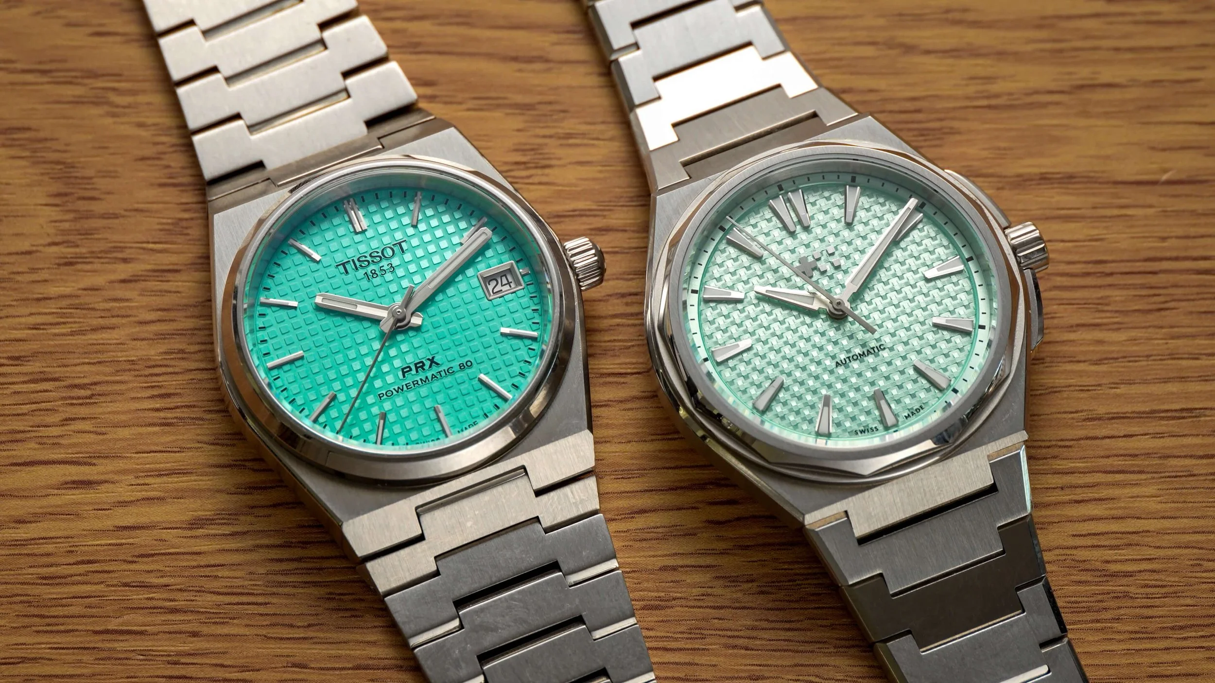
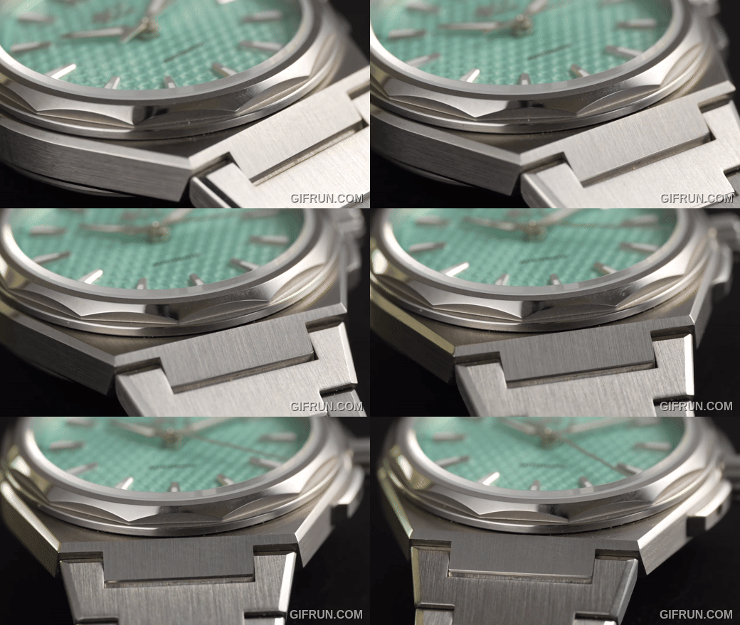
The dial here is far more intricate than that on the Sealander, or most other watches I’ve looked at for that matter, with micro-texturing that has, inevitably (given the integrated bracelet design), led many people to compare it to the Tissot PRX.
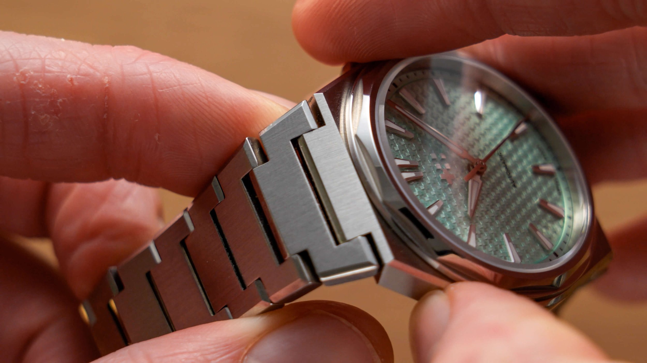
Now, the PRX is a watch I’ve finally been able to try recently, and I’ll go more in-depth shortly, but so far as the dials go, the CW is different gravy. True, the waffle dial on the PRX looks good and is the no-brainer choice versus the plainer Tissot models, however, that on the Twelve offers an extra layer of complexity and finesse. If we zoom right in, you’ll see that it’s constituted of mini crosses, no doubt a reference to their flag iconography, with each end tapered downward, creating this interlocking pattern which creates a much more reactive shimmer effect that elevates this dial to the next level.
There’s no doubt this looks awesome and the final result is much more impressive than many more expensive watches that I’ve handled or seen in shop windows. Nevertheless, this extra dimension does reduce legibility more significantly than the more regimented finish on the PRX, especially for lighter colors like this ‘Frosted Lichen’ version, though I wouldn’t call it a deal breaker.
The markers remind me a little of those on the popular Orient Kamasu, only taken up a notch, with two-tone finishing and an even pointier structure that combines nicely with the lance-shaped handset. They sit just inside of a slim, raised, color-matched chapter ring and they’re only accompanied by very limited text, namely the word automatic just above 6 and the illustrious Swiss Made title at the bottom.
Production
On that note, I’ve never been a massive advocate for Swiss-made watches. Given that the ‘Swiss made’ label often doesn’t mean that all the components are actually made in Switzerland, and that other countries are making fantastic watches nowadays, it doesn’t carry a huge amount of weight to me.
That said, it essentially guarantees that most workers in the production chain are in good working conditions and it also means that Christopher Ward is matching most luxury brands on this front; many similarly-priced or lower-cost brands are made elsewhere, reducing the scope for a like-for-like comparison.
On both models, I haven’t been able to spot any quality control errors, that even includes the segmented logo, which is also applied in a neater manner than that on the Tissot PRX; it sits straight on the top of the uneven surface, without any outline or border.
This Frosted Lichen is somewhat of a turquoise color and in person looks a touch more blue than the rather green stock images, though my pick would probably be one of the darker tones.
Watch Case
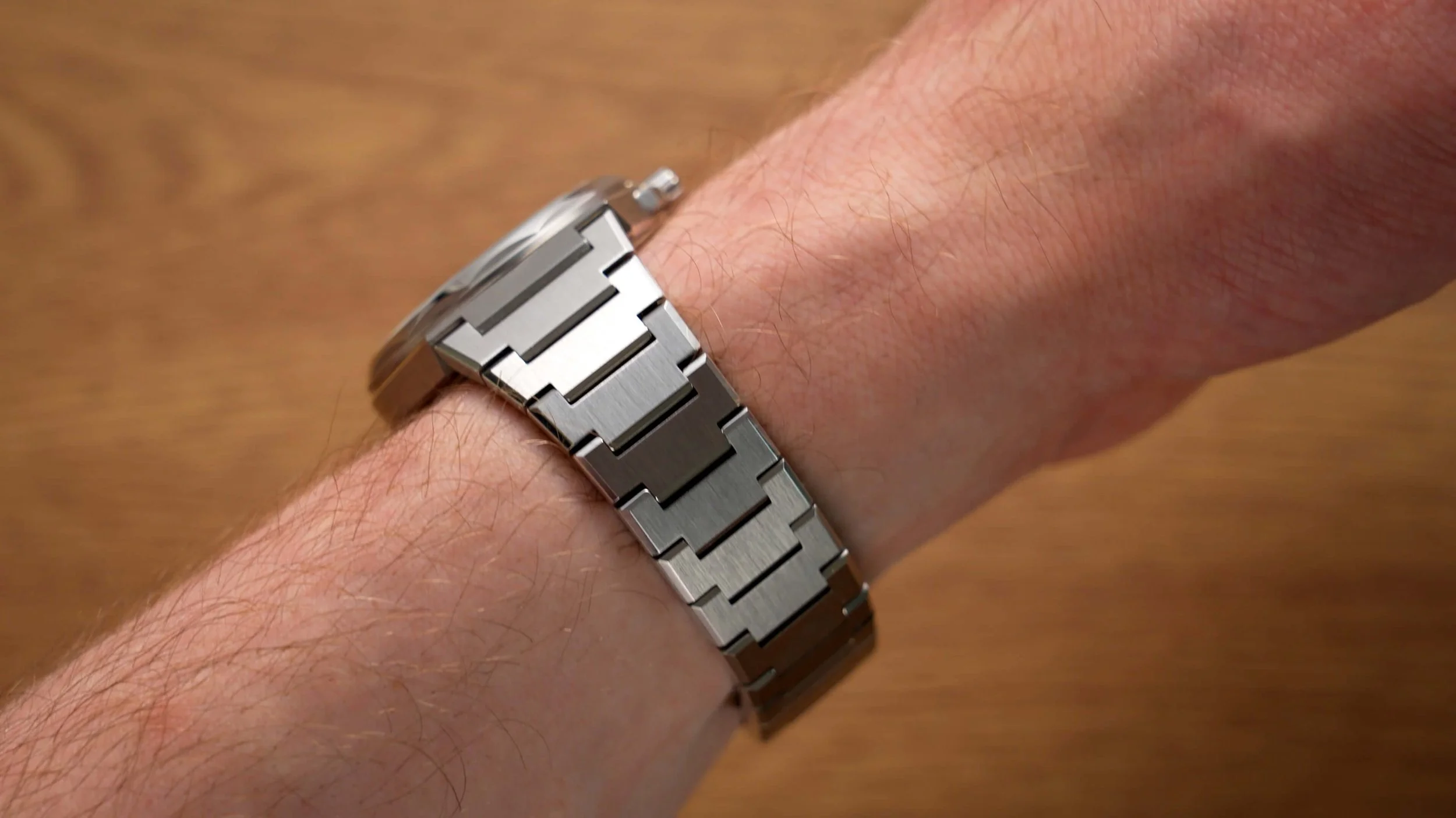
The case on this model is a little more unconventional. From the side you’ll see that the case is essentially lopped off at the lug area, at a slight reverse angle. It almost looks like a robots torso, with the bracelet acting as the arms protruding from the creature’s shoulders. This is one part of the watch I was intrigued by, as the layout here is the opposite of some other sports watches, with a built-in male end link that protrudes outwards. Despite this, the 36mm Twelve does have more wiggle room than the 35mm PRX models, who’s second links are virtually fixed in place, meaning it’s a tad more accommodating.
While the case finishing is just as good as the Sealander, the shape is much straighter, which means you will usually get a bit of space underneath the lugs during usage. The Sealander and PRX both give a flusher look, which I tend to prefer.
Bracelet
One thing the gap does leave room for is the quick-release bracelet system, which is also new to me. Unlike most quick-release bracelets, where the tabs are on the strap itself, here, they are baked directly into the underside of the lugs, as an extra part of the case, if you will. Functionally, mainly due to the increased size, these are much easier to use, and in my testing, I’ve not once gotten them stuck between my nail and nail bed, which is a common occurrence with most similar spring bars.
As for the bracelet itself, it integrates perfectly. It has exactly the same continuation of vertical brushing as the main body, and while similar, it boasts chamfers down each flank, so it looks a little nicer. Their efforts even extend to the clasp. This butterfly clasp has the same brushing and polishing as every other part of the bracelet; the first time I’ve seen such a thing attempted. Is this significant? No. Is it clear they’ve tried to go the extra mile? On this occasion, yes.
A lot of people have said the PRX bracelet scratches very easily. Unfortunately, I couldn’t spend long enough time with the watch to study that, and while such a sentiment doesn’t seem to be shared about the Twelve bracelet, I no longer have the PRX for a long-term comparison.
At present, the Twelve 36mm includes some shorter links by default, like the PRX and many other integrated bracelet watches, however, it doesn’t yet have the clever extension system found on the new Sealander bracelet. Hopefully, they consider implementing that across the board.
The only issue I encountered when sizing both bracelets was the screw links. Now, I generally love screw links, they’re a dream to size at home for most people, and they reduce the chances of scratching the bracelet. In theory, these should be better than the push pins used in the PRX. Nevertheless, several of these were far too tight, resulting in me damaging the screw heads during extraction. While I’m no dentist, given the sheer number of bracelets I adjust every week with my specialist tools, I don’t think my technique is to blame; it’s something Christopher Ward should look into.
Dimensions
On wrist, the Twelve 36 fits me really well and marginally better than the 35mm PRX, which verges on too small. My wrist is six and a quarter inches, for reference. With the crown guards, it’s about 37.2mm wide; without them, it’s somewhere in the region of 35.8mm, paired with a thickness of 10.4mm, including a raised crystal, and a lug-to-lug that’s very much up for debate, given the end link arrangement I just mentioned.
Design
If you’re wondering why it’s called the Twelve, well, that’s because of the bezel. You’ll see it has twelve sides...simple. What’s particularly neat is that this aligns perfectly with the twelve-sided case rear on the underside, which we’ll get to in a moment.
Now, I appreciate that Christopher Ward hasn’t opted for a run-of-the-mill smooth bezel or octagonal bezel, I mean, we’ve seen those all before at this point, haven’t we? Nevertheless, I can’t help but feel that I don’t love it. I can’t put my finger on precisely why, and I don’t hate it, I’m just not one hundred percent feeling it. The same can be said for the crown guards, which are sort of bolted on the side with hexagonal screws. Proportionally, I think both the crown and the guards protrude a little too much, considering the smaller case.
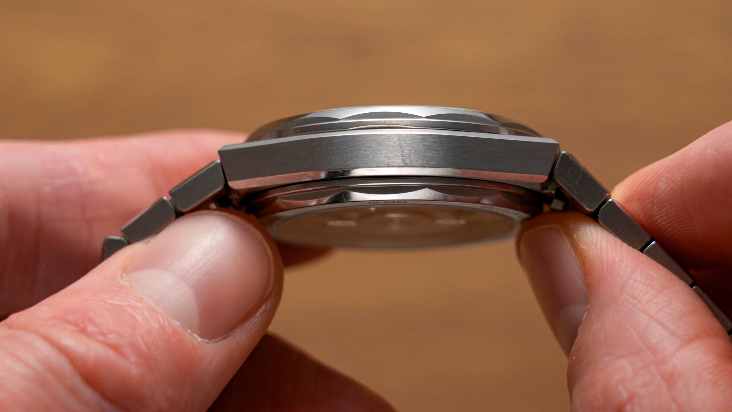
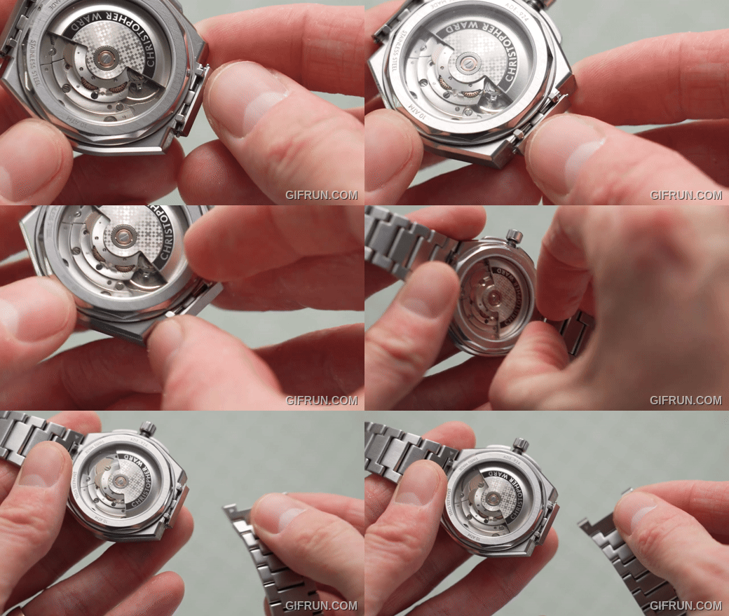
Still, overall, it is a good-looking watch, but again, I’d go for one of the other colors. One worry I had with this dodecagonal shape is that, again, I assumed the case back would present a challenge. You see, this version of the twelve completely lacked any sort of case opening holes, leading me to suspect it would involve a custom-fit tool, such as those used to remove the back of Rolex watches. It turns out that this isn’t a screw-back at all. Surprisingly, it’s a snap-back rear, with a minuscule gap under the 9 o’clock for sliding in a regular prizing tool or knife.
Christopher Ward told me that there wasn’t space for the screw arrangement present on the larger 40mm model but did assure me that their `100m water resistance’ claim was valid. Now, I imagine this won’t be a huge issue for most of you considering this watch. Your watchmaker will likely be doing all the fiddling for you. Nevertheless, given that most watchmakers use these expensive and highly effective case removal tools for screwbacks, I’d guess your watch is slightly more likely to get scratched from a snap-back case removal tool. The crown is at least threaded, like the Sealander and is again very smooth.
Before we get to the movement, it’s also worth mentioning that you can also buy the Twelve 36 in titanium. It’s grade 2 titanium, it looks just as nicely finished as this steel one, though it is an extra five hundred quid; that model comes in some slightly different colorways too.
Movement
Ok, inside the Twelve 36 is the same Sellita SW200-1 as in the 40mm version. It’s a similar grade movement to that in the Sealander GMT, but has a lower 38-hour power reserve and, obviously, no GMT functionality. The crown operates the hands, and that’s it. This movement is obtainable in lower-cost watches, such as the Formex Field I reviewed in 2022, which is notably less expensive, though that was a lower-grade version of the SW200.
Otherwise, you get the same eight beats per second as the Sellita in the Sealander GMT. This movement is widely used on watches in this price bracket, as well as in some watches that are around twice the price, from my research. However, you usually won’t find off-the-shelf movements in watches costing many times this one; theirs are often heavily modified or made in-house.
This one clocked in at a more modest +12 seconds per day on average, which is well within spec, but not as accurate as some automatics I’ve reviewed recently.
Final Thoughts
So, what do I think of Christopher Ward watches? Would I buy one and should you buy one?
Well, I think it’s fair to say that these watches are, without question, made as well as you could expect for around the £1000 mark.
That’s the crucial factor, really; they didn’t target a completely unrealistic price point. You’ll never rival a luxury watch’s level of quality at 150 or 200 quid. That’s impossible. Instead, their watches cost about £1000, and they have other models that are as low as £500 now. That just about leaves them with enough wiggle room to have a crack at giving these big companies a run for their money.
I think certain aspects of these watches are as good as most more expensive watches I’ve seen, if not better. The case finishing, the dial texture on the Twelve, and the bracelet innovation are all very impressive. Both models are noticeably better than the lower-cost watches I tend to review on this blog...as they should be. The brand also has an aptly generous returns policy to go alongside their product offerings.
From that perspective, I do believe they are about where they pitch themselves on their site. After all, back in 2004, Christopher Ward launched as the very first online-only brand targeting the premium end of the market, so their advertising of the same quality at a lower price is somewhat plausible.
That said, does that mean I’d buy one?
Well, I’m not sure I could justify spending this much on any watch, regardless of quality. My earnings are not the highest, so it would have to be something mind-blowing that I absolutely loved for me to consider parting with that much cash when I know it could be spent on amazing, more meaningful things like visiting new countries, my beautiful cats or putting towards important life goals like owning a home. Neither of these particular watches cross that threshold for me. I doubt I’d feel a great deal more satisfaction wearing a £1000 watch every day over a £500 or £600 one; the latter is usually sufficient for my needs and preferences.
If you love the design of these watches or aren’t so fiscally restricted, they are very well made and probably won’t disappoint you. They’re not a misleading scam named after a fictional character like many similarly posturing brands, and 99% of you probably won’t be able to tell the difference between these watches and others that cost 2 or 3 times as much.
At the same time, it still takes a trained eye or a pretty good camera lens to notice the material differences between these watches and some of the best £600 watches I’ve reviewed. If you’re more budget-conscious like me, their lower-cost offerings could be worth a look.
What I wouldn’t do is go into a purchase like this expecting these watches to hold their value or increase in value. That’s one of the next things I always get asked by newbies; they’re always like “I heard I can make money from investing in a Rolex, should I do it?”. While they have been going for 20 years now, Christopher Ward hasn’t accrued that same horde of speculators who are buying them purely for monetary reasons, and as such, the resale value is not as good as the luxury brands whose build they may be rivaling.


